Yesterday saw the Beta launch of a new Mint.com-type startup in South Africa called 22seven. They’re essentially aiming to give people better insight into the money they spend, and help them make better decisions about that. Or to put it in their own words:
We use smart information-gathering technology so our users can see all their financial stuff in one place. W’ve applied insights from behavioural economics so our users can better understand the way they think. And by employing principles of play, our users become more engaged, and more willingly engaged, with their money.
It didn’t take long for the banks to start freaking out about the security implications of giving your banking credentials to a third party, but there have also been some defenses of the safety of the service. Instead of rehashing those arguments, I’d like to make three quick comments about the new service.
An observation
I’ve been watching this unfold with fascination over the last 24 hours. Everyone who attended the launch event in Johannesburg seemed really impressed, but it didn’t take long for some (legitimate) concerns to arise as people started trying out the service:
My mom told me never to accept sweets from strangers and to give out my pin number… So… Yeah… Sorry 22seven…
“” Cathryn Reece (@CathrynR) January 26, 2012
That’s a sentiment I agree with, but things started to go downhill a bit from there as the tweets became more and more negative. We’re a finicky bunch of complainers, aren’t we! But as I caught myself just in time before getting sucked into the negativity vortex, a phrase jumped into my head: Schlep Blindess. As in – these guys don’t have it. In Paul Graham’s excellent essay he describes schlep blindness as the inability to identify hard problems to solve:
The most dangerous thing about our dislike of schleps is that much of it is unconscious. Your unconscious won’t even let you see ideas that involve painful schleps. That’s schlep blindness.
He ends his essay by explaining how to avoid schlep blindness:
Some ideas so obviously entail alarming schleps that anyone can see them. How do you see ideas like that? The trick I recommend is to take yourself out of the picture. Instead of asking “what problem should I solve?” ask “what problem do I wish someone else would solve for me?”
And that’s why I admire the creators of 22seven. They’re working on a problem we all want solved, but most of us are too scared to work on. And for doing that, they deserve enormous credit.
A complaint
Speaking of finicky complainers, can I be one of those for a minute? Ok, cool. Obviously my first instinct was to scrutinize the design of the site, and even though there’s a lot to like about it, I have to mention a couple of things that I believe are not implemented correctly from a UX Design perspective.
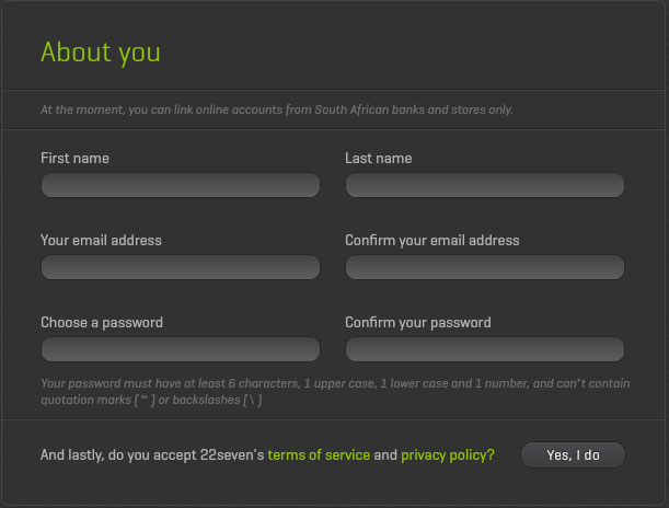
First, forcing someone to wait for a Flash (!!) animation/introduction to load when they click “Register” is just not a good thing. Users don’t have patience for that stuff. If I ask for a registration form, my expectation is to see a registration form immediately. But my main beef is with the registration form itself:

Here are some of the issues:
- The text has very low contrast with the background which makes it difficult to read. Come on, everyone – join the contrast rebellion!
- We know that it’s bad to use multi-column layouts in forms.
- Speaking of contrast, what stands out are the phrases “About you”, “terms of service”, and “privacy policy”, while the primary call to action (“Yes, I do”) is a grey button on a dark grey background.
- While I’m nitpicking, if the button says “Yes, I do”, shouldn’t the title be “About me”?
We just don’t have to re-invent forms any more. The hard work has been done for us – we know how forms should be designed. And I don’t want to get into the Flash debate again, but why build this thing on a waning technology when you can build a responsive HTML web app that works on all devices?
A suggestion
Lastly, I’d like to offer a suggestion. If it is indeed true that 22seven has not met with South African banks yet, that’s a situation that should be rectified soon. In fact, my suggestion is that 22seven meets with one bank and work with them on an API solution that will allow them to access users’ banking information without having to store their credentials at a 3rd party. That’s what OAuth is for. And based on everything we know about Michael Jordaan (the CEO of FNB), wouldn’t FNB be the perfect bank to partner with on this? Once they’re on board, and FNB’s handsome and smart clients start using the service, the other banks are sure to follow.
I’d like to end where I began – on a positive note. I’m truly grateful that 22seven is tackling the banking/money management problem in South Africa in a very real and committed way. I think they vastly underestimated the backlash they would get from users when they’re suddenly asked for their online banking credentials (otherwise the web site would have been littered with trust-building explanations and images). But that’s a fixable problem, and so is my UX nitpicking – they’re not difficult issues to address.
So despite my complaining, I’m extremely excited about 22seven, and I’m rooting for them to succeed. I hope you’ll join me.