Earlier today I delivered a talk called “How to build an audience in 743 difficult steps” at WordCamp Cape Town. This is a written version of the core points from the talk.
The biggest question every writer asks when they start publishing online is, “How do I get people to read my stuff?” There are many answers to this question, and these answers are usually now referred to as “content marketing”. Proposed methods run the gamut of SEO and Marketing advice, from back-linking and infographic making to the perfect way to write headlines (“People love lists!”).
This is a story about deciding to take a route that avoids most of these traditional content marketing methods. It’s a story of how a struggling blog with an insignificant number of readers has become not only a source of great joy and expression for me, but also a source of non-insignificant income. This is definitely not a story about how to get to 1 million page views a month. It’s a story about how to make your page views count.
Why write, anyway?
We should start at the beginning. Why write and publish online? It’s a lot of work and the payoff doesn’t always seem very clear. So why do it? I believe there are two main reasons for maintaining a personal site (and publishing there regularly).
First, it’s an excellent way to practice what Clive Thompson calls The art of public thinking:
The process of writing exposes your own ignorance and half-baked assumptions. I often don’t realize what I don’t know until I’ve started writing, at which point my unanswered questions and lazy, autofill thinking becomes obvious.
I’ve found this to be 100% true. Often, when I don’t understand a topic, I’ll just start writing about it, and in doing so the areas that need clarification start to crystalize. I also often start writing about something I think I understand well, but as I’m writing it becomes clear that I have huge knowledge/experience gaps somewhere. So I go away and figure it out before finishing the piece.
Second, your personal site is your resume. Many people have written about the importance of owning your identity, but I think Mitch Joel sums it up best in The New Resume:
Resumes have transformed from these static white pages into three dimensional, real-time personas that live, breathe, share and connect. Nothing will impress more than an individual who has taken the time to craft and share their perspectives about either the industry that they serve or what inspires them.
I’ve written quite a bit about the idea of work as platform, and owning your identity — separate from where you currently work — is a crucial component of that.
Let’s build an audience!
So those are the two main reasons I started this site. I wanted to get the benefits of public thinking, I wanted to have a record of my thoughts, and I wanted to do it in a way that’s hopefully interesting enough for others to enjoy as well. With those goals in mind, I was ready to go. I basically went off and did a whole lot of this:

Unfortunately, as anyone who has tried starting blog knows, “if you build it, they will come” is a big fat lie. Instead, this started happening with increasing frequency:

So, instead of happily “building an audience”, I started each day clearing out angry comments, and then walking around like this for the rest of the day:

Once that happens — once things suddenly don’t go according to plan — the lure of the easy can easily get you. Instead of focusing on providing quality content, the shortcuts that you’d vowed you’d never take suddenly become very attractive. Instead of automatically trashing those incessant emails about backlinking and infographic creation and paid content creation, you start reading them and before long you start considering all the ugly SEO tricks you’ve publicly scorned. And before you know it, your site looks like this:
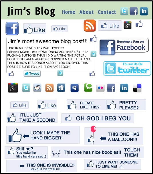
Source: How to get more likes on Facebook
This is a dangerous place to be, and I’ve been there more than once. There have been many times where I’ve been on the verge of just stopping and shutting the site down, because I couldn’t see the use. Yet every time I came close to closing up shop, one question kept coming up in my mind: Why are we so unwilling to work hard for the things that we want? And then I saw someone articulate that thought perfectly…
The long, hard, stupid way (3 lessons)
I came across the idea of the long, hard, stupid way in a brilliant talk by Frank Chimero. He describes an episode of the TV show Treme where chef David Chang describes his cooking philosophy:
Just because we’re a casual restaurant, doesn’t mean we don’t hold ourselves to fine dining standards. We try to do things the right way. That usually means doing things the long, hard, stupid way.
Go ahead and think about a time when you learned to do something really difficult. Maybe it was learning to ride a skateboard, figuring out a new math equation, or debugging your first piece of code. Do you remember the strain, the frustration, and the countless failures? And do you also remember the enormous satisfaction you felt as you slowly mastered that task? Do you remember how doing it the hard way carried with it not only the benefits of learning that skill, but also many tangential thoughts or experiences that sparked new passions or interests?
When we do things the hard way, we invest in ourselves in the best possible way. We kick off an endless cycle of learning and mastery that helps us grow and lead fulfilling lives of purpose. When we take shortcuts, we become mere pretenders. We learn how to play the part, but there is no substance or continued growth. The instant gratification makes us build the house of cards ever higher, which brings anxiety about the whole thing coming tumbling down. Why would we shortchange ourselves like that?
Cal Newport nailed it when he said, “There is no avoiding the deliberate strain of real improvement.” If you want to become a better writer, read more and publish more. If you want to learn to design/code/fly, watch fewer episodes of Downton Abbey and practice the things that don’t come easy. And if you really want more Twitter followers, make and share things that are awesome, and be patient.
So what does this mean for online publishing? Over time I’ve learned 3 important lessons that have formed the foundation of how I write Elezea, and what I want this site to be.
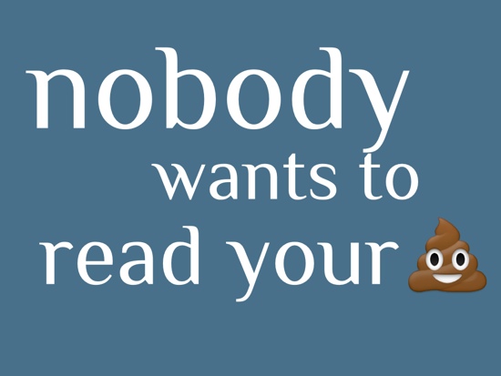
The first lesson is Steven Pressfield’s timeless advice in The Most Important Writing Lesson I Ever Learned:
Nobody — not even your dog or your mother — has the slightest interest in your commercial for Rice Krispies or Delco batteries or Preparation H. Nor does anybody care about your one-act play, your Facebook page or your new sesame chicken joint at Canal and Tchopotoulis.
It isn’t that people are mean or cruel. They’re just busy.
Nobody wants to read your shit.
The thing is, once you realize that no one cares about the stuff you write, it’s actually quite liberating. It’s at that point that you realise that writing is a simple transaction between you and your readers. They have time and attention — which is more valuable than ever — and you have to provide content that is worthy of that time and attention. Otherwise we’re just wasting people’s time, and they certainly won’t stick around for that. No matter how many times I read it, I still love this Paul Ford quote from 10 Timeframes:
If we are going to ask people, in the form of our products, in the form of the things we make, to spend their heartbeats on us, on our ideas, how can we be sure, far more sure than we are now, that they spend those heartbeats wisely?
Remember the transaction between you and your readers, and make sure that when they pay you with their time and attention, they’re getting something worthy in return. But wait… how do I know if something is worthy…?
The second lesson I learned is that not everything is worthy of people’s attention. Content creation is becoming increasingly robotic and algorithmic, so instead of thinking about how people spend their heartbeats, we’re thinking about how to get them to click on things, regardless of what’s behind that click. We know that Yahoo tests more than 45,000 combinations of headlines and images every five minutes on its home page. We also know that The Huffington Post will serve different versions of a page to a couple of random groups and, after five minutes, the best headline will be selected. That sounds really smart, and they’ve obviously been extremely successful at generating traffic, but that approach is missing two key components. It’s missing what Merlin Mann refers to as Obsession times Voice.
Obsession is that thing that people want you to shut up about. The thing that wakes you up at night, the minuscule detail that you can’t stop thinking about. What is that thing that you just can’t let go of? That’s your obsession.
Voice is how you talk about that obsession. It’s the perspective that you bring on the topic, and the way you communicate why it’s your obsession.
So there’s a simple formula for what makes something worthy of people’s time. It’s Obsession times Voice. It’s a unique perspective on something you care deeply about, that no one else can copy. That’s the kind of thing I want to read on the web. Look at sites like The Loop, Daring Fireball, and The Brooks Review. They’re all successful because they’ve figured out the Obsession times Voice equation.
The third lesson I learned is that writing is relatively easy when compared to actually publishing the stuff that you write. That’s where it gets real. I still feel like this every time I hover over the Send to Blog button:

The thing is, publishing what you write is the only way you’re going to get better at it. Once your words are out there, it will be scrutinized. That is terrifying but also really exciting. People will correct you on things when you are wrong. That is a bonus benefit of thinking in public: you learn so much from feedback. But that only happens if you get things out of your drafts folder and onto your site.
How is that working out?
Building Elezea on these principles has worked pretty well for me so far. It has not only brought writing and advertising opportunities, but more importantly, it has brought me a great community of readers who communicate regularly via email and Twitter and other platforms.
If I can sum up what I’ve learned about online publishing in one sentence, it’s that who your readers are is more important than how many you have. Sure, I’d love for my traffic to grow a little bit faster. But I won’t do it if it comes at the cost of compromising the principles I’ve described above, because I know a click is empty until someone actually sticks around for more than a few minutes. That’s what makes this a meaningful and fulfilling experience, and that’s what makes me push on and keep writing here week after week.
So for those of you who keep coming back, THANK YOU. Not to get all mushy on you, but you make me happy.
For those interested, the full slide deck from the talk is here.
