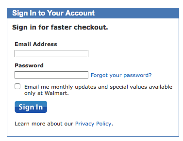
This is the login screen on Walmart.com:

It looks like any other login screen, with one difference. See that check box? What does that check box usually indicate?
Yep. The standard pattern on the web is to use that space for the “Keep me signed in” check box on login screens. Here are a couple of examples I quickly went to:

That Walmart interface was designed to trick people into signing up for marketing email, since most people will simply check the box without reading the text. We really need to stop with these dark patterns.