A while ago I wrote about expanded customer journey maps as a way to plan for device-agnostic design. But that document is only half the story. Expanded customer journey maps are great because they force us to plan what content will be needed before we move to page layout. That provides a great starting point, but crossing the chasm between knowing what content should go on a page, and how to design the best layout for that content can still be quite difficult.
What we need is an effective way to make content hierarchy decisions across all pages so as not to lose sight of the overall consistency of a site. Enter Content Slice Diagrams as a way to accomplish three fundamental tasks:
- Get an overview of the content across a site to make sure nothing is missing and there is consistency in layout where appropriate.
- Design the right size and hierarchy of each of the content chunks on a page, and see how it affects the page as a whole, as well as related pages.
- Provide any guidelines that writers may need to keep in mind as they create the content for the site.
Once the content slice diagrams are completed, designers and writers should have the following information:
- A clear understanding of the hierarchy of each page, which leads seamlessly into mobile first layout design.
- What the structure and nature of the content in each chunk will be.
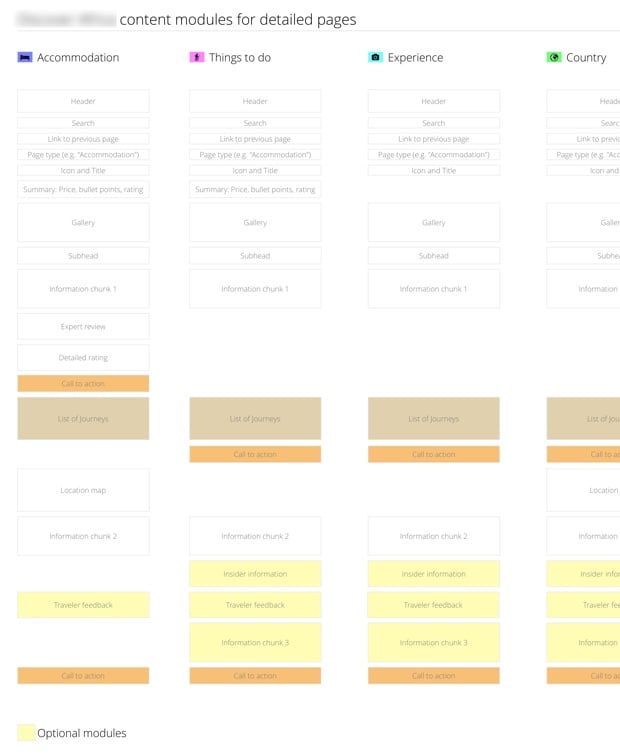
That’s everything you need to start working on layout. As an example, let’s say you’ve worked on the content plan (see my post on expanded customer journey maps for an example), so you know what type of content needs to be on a page — but you’re not sure how to lay it out. A Content Slice Diagram can help:

What we have in the image above is a list of pages that goes from left to right, with rectangles representing content chunks on the page. Calls to action and optional modules are given a different color so that they’re easy to differentiate. When we did this for a travel site we realized that we sometimes had the call to action in a different spot, so we were able to get consistency across pages. We also moved the content chunks around until we arrived at a hierarchy that made sense.
You’ll notice that this looks suspiciously like the layout for a mobile screen… That wasn’t the original intent, but it ends up being a welcome side effect of doing content slice diagrams: it’s a great blueprint for mobile first design.
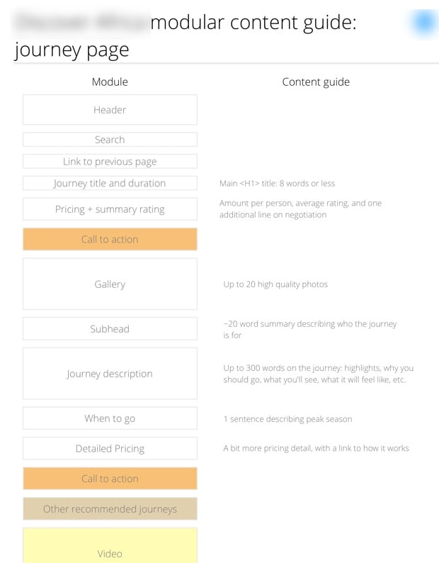
Once the hierarchy is set, you can create content guides for writers to give them the structural information they need to start writing:

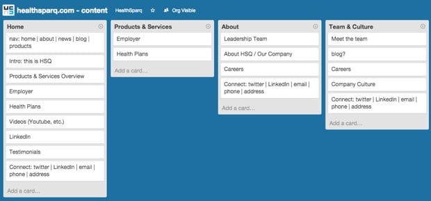
When I brought this technique to HealthSparq, my colleague Allan White had a great idea. He rightfully commented that OmniGraffle doesn’t make it particularly easy to drag content chunks around quickly. So he decided to use Trello instead. It allowed him to have collaborative meetings with the Marketing and Development teams as they discussed the hierarchy of each chunk:

As I’ve mentioned before, I hate needless deliverables as much as the next person, but I really like deliverables that help us design better products. And I think Content Slice Diagrams make for a great addition to the tools we have at our disposal to design device-agnostic, content-first experiences. Use at will, make it better, and let me know how it goes!