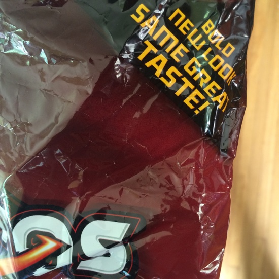
You know that thing where you get home after a long day and catch yourself some time later staring off into space, pigging out on a bag of Doritos and…? Oh, uhh, no me either. But I heard that happens to some people.
Anyway. I’ve been thinking about that phrase you always see on consumer goods packaging when they go through a redesign. The almost-apologetic and slightly nervous proclamation that even though the thing now looks different, nothing else has changed:

Clearly marketers have learned that consumers don’t like redesigns, so they started using this message in a defensive attempt to soften the blow for people. Even then, it doesn’t always work. Remember when Tropicana reverted to their old packaging because some people called the redesign “ugly” and “stupid”? We should know this by now: people have opinions, and they are going to make a big noise about those opinions.
Yet whenever we go through a website redesign process we appear to develop some amnesia around this topic. We seem surprised when people spew vitriol all over Twitter, and we try to make ourselves feel better by saying that they’ll “get used to it.” Some part of me really wants us to create “Bold new look, same great functionality!” gifs for those kinds of projects, in the spirit of the “Under construction” gifs of yesteryear. But just like in the case of Tropicana, I don’t think that will work.
What’s the alternative? Well, first, we have to realize the biggest problem with big web/app redesigns. It might be the same functionality underneath (or not), but that functionality is often harder to find, and that frustrates users to no end. The good news is that we work on the web, not in packaging. We can do things incrementally! In the words of Cameron Moll, “Good designers redesign, great designers realign”. I’ve also written about this before in The Data-Pixel Approach To Improving User Experience:
The main problem with big redesigns, therefore, is that, even though objectively the UX might have been improved, users are often left confused about what has happened and are unable to find their way. In most cases, making “steady, relentless, incremental progress” on a website (to borrow a phrase of John Gruber) is much more desirable. With this approach, users are pulled gently into a better experience, as opposed to being thrown into the deep end and forced to sink or swim.
Look, I’m not saying this is a perfect analogy. But I spent a lot of time spacing out about this on Friday, so I thought I’d write it down for posterity. What I’m trying to say is, let’s worry less about bold new looks in web design, and instead work on making things taste better.