As the UX field grows and more companies start taking user-centered design seriously, we need to start thinking about how we’re going to rescue all those stray sheep of the UX world — those areas that are getting left behind because we’re (understandably) focusing on the obvious, most important things. Two of these “stray sheep” issues come to mind immediately.
One is bad error messages, which is the subject of a whole other rant, so I won’t go into that now (I’ve started a Flickr group to collect examples – come join and contribute!). The second is user onboarding, which Whitney Hess defines as follows:
Onboarding is the process by which you can help users overcome the cold-start problem””a blank profile, an unfamiliar interface, a general feeling of “what the heck do I do next?”
And that’s what I’d like to address in this post.
The importance of user onboarding
When Jakob Nielsen wrote his 10 Heuristics for User Interface Design in 1990, he devoted one of his rules of thumb to user assistance and help documentation:
Even though it is better if the system can be used without documentation, it may be necessary to provide help and documentation. Any such information should be easy to search, focused on the user’s task, list concrete steps to be carried out, and not be too large.
Yes, first prize is to have a system that doesn’t require onboarding or documentation. But that’s not always possible, especially in the fairly new field of mobile design. So, if you need to provide onboarding help, what’s the best way to do it? A List Apart recently published an excellent article (Good Help is Hard to Find) on how to write good Help content, with specific reference to the importance of context:
Help content can be rendered in many ways, but if possible, embedding it directly within the feature it serves is almost always the best choice. When help is offered in context, affordance is high: That is, the help is obvious to the user. Even better, context-based help is the least disruptive to workflow, as it doesn’t require the reader to view a separate page.
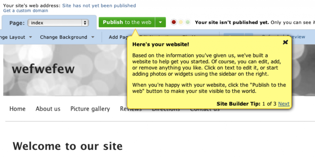
To name one example of contextual onboarding: when you first sign up for an account on website builder Yola.com, you see this screen, which provides tips on how to get started:
You can write whole books on good and bad implementations of user onboarding in web apps (The Baymard Institute recently posted 3 Examples of Inline Help, which is well worth reviewing). But I want to focus specifically on how user onboarding should be applied to mobile touchscreen applications, because we don’t yet have best practices for that.
Here are some best practice guidelines I’d like to propose for onboarding users on these devices:
1. Don’t show all the information at startup
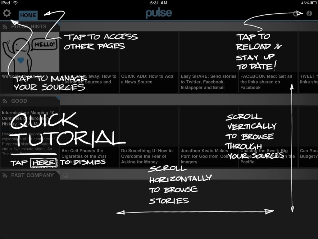
When you first start up the magazine app Pulse, you get this screen:
It’s certainly different – fun and quirky. But it’s also overwhelming and too much, too soon. I haven’t started using the app yet. In fact, when I installed it I wasn’t even sure what it does – is it an RSS reader or a news feed from predetermined sources? Or something completely different? I can’t do a tutorial on something I don’t understand yet.
So, guideline #1: make sure that users have familiarized themselves enough with your app to have the correct mental model before you start teaching them how to use it.
2. Show one (or only a few) tips at a time
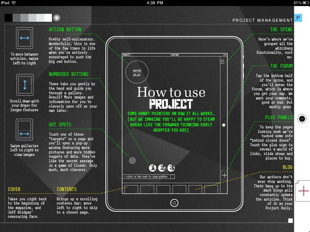
Project is another magazine app that’s getting a lot of press at the moment. Project adheres to rule #1 by getting you a few pages into the experience first before showing you the ins and outs of the app itself. But then you get to this page:
That is just way too overwhelming. Ignore, for the moment, the heavy visual design that makes this so hard to read. Even if this was designed in a clearer way, there is still too much information on the page, too many things to try to absorb and commit to memory. Speaking of Nielsen, remember this heuristic:
Recognition rather than recall: Minimize the user’s memory load by making objects, actions, and options visible. The user should not have to remember information from one part of the dialogue to another. Instructions for use of the system should be visible or easily retrievable whenever appropriate
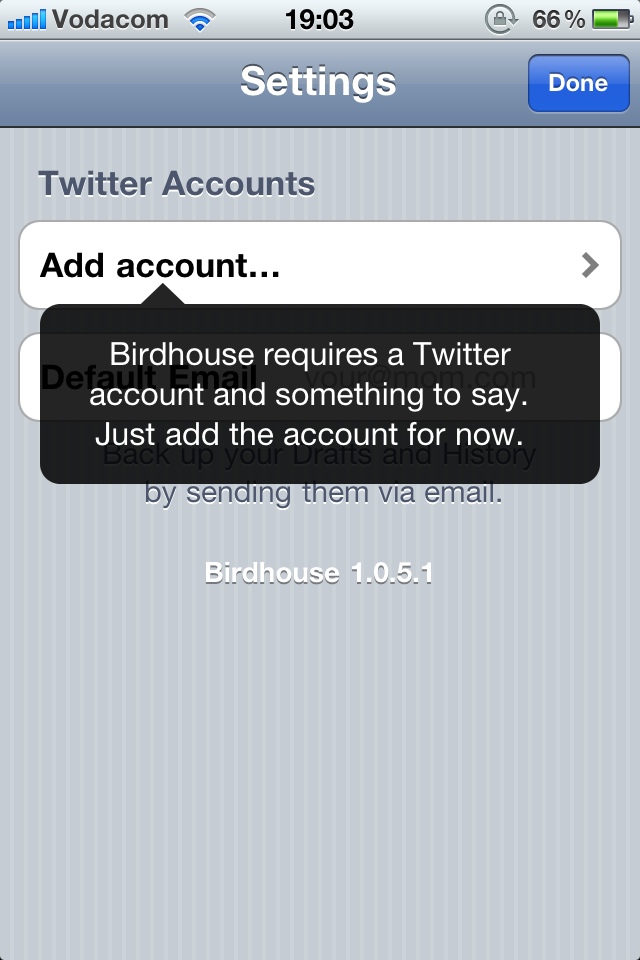
This page increases cognitive load significantly, and requires the user to remember too much. And this brings us to guideline #2: Show users only the information they need to take the immediate next step(s) for using the application. Consider, for example, two screens from the iPhone app Birdhouse:
3. Always keep the app’s context visible
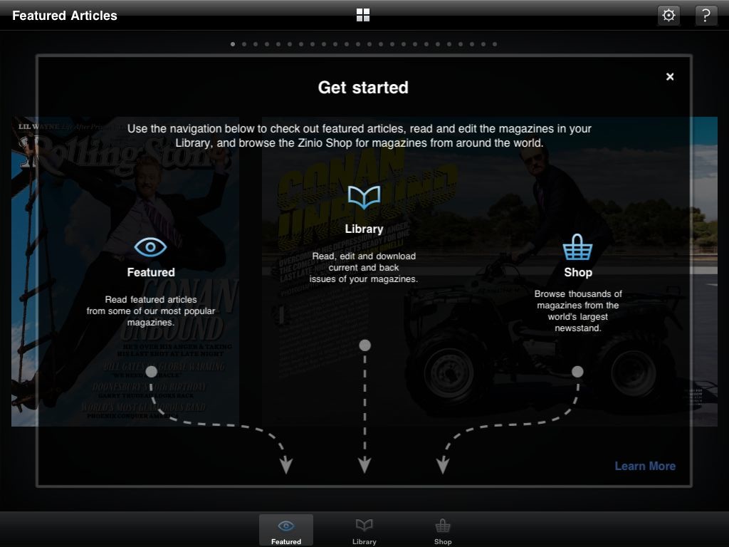
Yet another magazine app, Zinio, does their user onboarding this way:
Even though it could be simplified, this is a pretty good way to get users started. It explains what each of the areas of the app are, and it uses arrows to keep the context of the app visible, so that you know where to find the areas you’re looking for. Guideline #3: Make sure users have a clear link between the information you give them and how to access/use that information in their everyday use of the app.
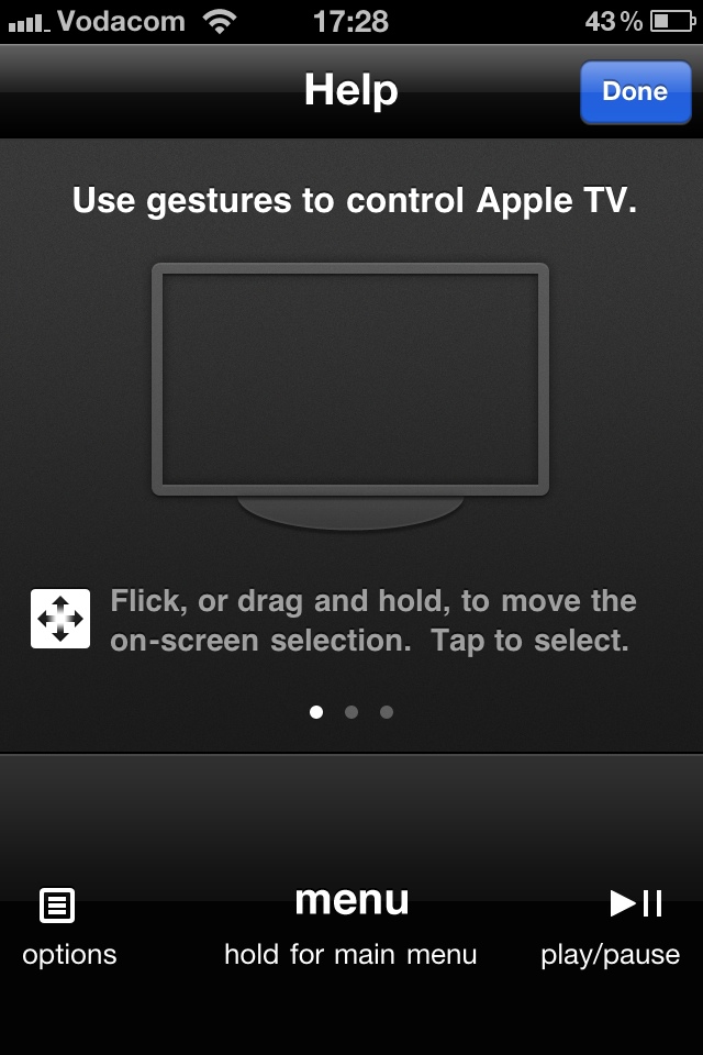
Another good example of this is the Apple remote app for the iPhone. When you tap the Help icon, the interface stays the same, but some additional information is overlayed across the screen to show you what each of the areas are for:
Summary
In this post I proposed some guidelines for onboarding users on apps for mobile touchscreen devices:
- Make sure that users have familiarized themselves enough with your app to have the correct mental model before you start teaching them how to use it.
- Show users only the information they need to take the immediate next step(s) for using the application.
- Make sure users have a clear link between the information you give them and how to access/use that information in their everyday use of the app.
This is certainly just a start, so I’d love to hear more suggestions — how can we quickly and effectively onboard users on mobile applications?
